Moby video winners.
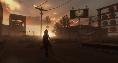
Alas I didn't win the Moby contest thingy for the unfortunate reason that the others were better than mine. I really would have preferred to blame it on politics or something. Sigh. I will post mine and then the other finalists and finally the winner. I might as well write my take on each because wft its Friday, and its fun to give your opinion.
I think this one might be my favorite. Only thing I would say is that the music is completely unrelated to the video. I don't find they fit together at all. I do love the video though, fighting the bee and then saying "wrf was that" was priceless.
A creative interpretation in this one. Nicely filmed but personally I am kind of tired of watching humans doing human things. We are endlessly fascinated with watching ourselves so not surprised this is a finalist and it deserves to be.
Did I say the top one was my favorite? maybe this one is actually. It was really creative and he deserves a medal for that editing. Told a touching story in an unorthodox way. The music and visuals fit perfectly and really just enjoyed watching it.
Meh.
I really liked this one too. Maybe this one is my favorite. Really planned out the sequence well with lots of variety.
So this was the winner. To be honest I don't really like it. Thats not sour grapes either. I just really am surprised Moby picked this. Its kind of funny sure and pokes fun at celebrity. Was probably entertaining to see view himself in this manner. I guess it depends from how deep within Moby this song was created. If the lyrics and mood came from his soul then how can you let the visual interpretation be corrupted so far from what you were trying to portray? If on the other hand it was created with sheer technical skill, and at no time did he feel the emotions of the song, if this song was not his baby, but rather a necessary component for a full length CD then I can understand the lack of concern at its portrayal visually. I don't recall if I mentioned at another time on my blog how earlier in my career I used to paint things which were too connected to me. I could not sell them as they meant too much, but worse, I feared to try dramatic changes to them as I was afraid of ruining them. You can't advance if you are afraid to take chances so I had to "cure" myself of this problem. The way I did this was to take my favorite paintings and burn them, bury them, sink them in a lake and hide them. Some were preserved carefully in plastic and buried in construction yards at night. One is now under a gas station not far from me. Anyway, this severing was necessary for me specifically. I can now work on things which i see as almost perfect and still have the ability to try new things because the alternative is losing them forever.


Comments