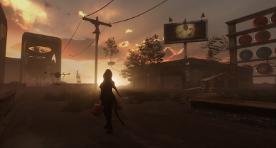
#1 "Under the tree that died" by AM Radio
I often find that in Second Life art there are categories of strengths to each builder. For example I may see someone create a technical/scripting work which is brilliant yet perhaps visually its a bit lacking due to a weakness in another area such as composition. Other artists may create a beautiful sculpture using traditional concepts of form or negative space yet are missing unique SL capabilities brought on by scripting. AM Radio is an artist who is very well balanced in this regard. If we break down this build we can see some of the variety which makes this build successful. And as I said at the beginning of this top ten, these are just my favorites over the year and I am not proclaiming them to be the ten greatest works of art in 2009.
The composition of UTTTD has some great elements which work together. On the large open space we have three main areas. The vehicle, the tree and the umbrellas. From a distance it creates triangulation with the tree raised above and in the middle of the other two elements. It creates the shape of a pyramid and as a result gives the impression of stability. The left hand side with the vehicle is heavier than the right hand side with the umbrellas. In a RL composition this would unbalance the piece giving the viewer the feeling that the left side could tilt and fall down. Creating balance in a composition is an ages old struggle and depending how you want the viewer to feel when observing your work, is an important element. If you wanted to portray a person on the edge of a cliff contemplating stepping off then having the composition heavy to the side of that figure would give the viewer the feeling that they were being drawn off the cliff. So how can a heavy vehicle be balanced with several light umbrellas who are almost ready to be blown off into the air? Its done with movement. The umbrellas can't compete with the vehicles weight but unlike a static painting they can move. I believe the movement draws the eye and gives them enough strength compositionally that they are able to balance the piece. So all these elements give the feeling of a location that is stable with little change over the years. The angle of the vehicle suggests the driver had to stop suddenly upon seeing the tree, and we have arrived at this moment as either the driver or as a witness. The roots of the tree are not drooping with gravity but rather float out horizontally suggesting the tree is comfortably floating there. Its not a scene of anxiety but of quiet curiosity.
The colour composition of the work is based off a small section of the colour palette using mainly earth tones. AM is a colourist and one of his greatest strengths is understanding how to use colour within a piece. To keep the calm nature of this build he has refrained from creating any high contrast colour sections. The strongest area of colour in the build is to the right with the umbrella handles and the strongest being the red door. Having placed the colours to this side also help balance the piece. I have taken the liberty of choosing this sky, but I found that most skies allowed the composition to remain intact.
Aesthetically the composition is great. At this point we look at the umbrellas. AM has scripted them to move quite convincingly with wind. They spin and twirl and in a way are a type of visual ballet which the viewer can watch after leaving the still portion of the composition to the left by the vehicle. It creates variety going from stillness to movement. From a limited colour palette to one which now introduces the red of the handles and door. These elements are subtle and AM has added the scripting without overdoing it. This is how I interpret AM's work and its the reason why I picked this as my favorite build from 2009. It was a pleasure for me to speak about some of the great creators in Second Life and I hope you agreed with one or two of my picks.
AM Radio wrote an essential comment to this post which explains his work far better than I can. I am going to post it here as an addition.
Thank you for the thoughtful write up Bryn.
I would just add a few thoughts to further the discussion, but are in no way a disagreement of your writing.
I try to provide both a refuge and a destination in all of my builds. I believe this to fundamental to a sense of stable composition in virtual worlds in addition to visual structure. The psychological sense of place is rooted in an index which defines some level of safety. The automobile, which has become modern armor in real life as we sweep across the modern landscape, provides a point of refuge, as if we could get in it to escape the rain or some unknown danger. The tree provides a mystery which beckons the viewer to leave the relative safety of proximity to the car. A telegram on the ground rewards the explorer and brings them closer to the umbrellas and door. The umbrellas and the door provide the prospect to find further places of refuge. The umbrellas move more like a tide, with the door a seeming undertow which beckons the user to open it. An image of the tree floating in the air sits in the road in front of the door, suggesting that the door and the umbrellas hold some clues to the mystery that first drew the viewer from the automobile.
In that sense, once the viewer experience each section of the build, there is a fulfilled sense of and experience which completes the viewer's requirement for defining a complete place. This is not unlike post modern life where we are in a constant state of tourism; as we drive, as we work, as we use the internet we have all become expert at high speed pragmatic criticism of prospective opportunity and destination. We're always looking for signs of prospect from the relative safety of a known refuge. I am referencing the work of Jakle, which I have applied to virtual experience and still exploring the validity of this use of tourism as fundamental to virtual experience. http://www.amazon.com/Visual-Elements-Landscape-John-Jackle/dp/0870235672
If you visit my other builds with this in mind you will see these elements of refuge. Each refuge attempts to provide a visual or functional horizon which indicates prospective destinations of refuge as points of safety and interest.
The composition of a full and unified experience is as important as visual composition within virtual spaces.
-AM


Comments
hope you will be doing this for 2010 as well!
How to Eat an Apple
It’s a sin to eat an apple with a knife
To cut and carve the seeds womb
Like an autopsy on your mother
Nursed by floods and fire
Her life was not choreographed by logic
And her death should be climatic
Dig in with your whole mouth, let the chipped and rounded
Curves of your teeth pierce her flesh honestly
Wet rivers of juice falling from your chin
By the dancing movement of your jaws
Her succulent translation of the sun’s heart
Now becomes your life blood's elixir
Honor her with your attention,
Her plethora of shapes, her raiment of colors,
She is a mirror of our kindred genesis
The undulating canopies of her childhood
Are the same tendrils of your skulls inner garden
Cannibalism never tasted so sweet
Semaj
I have spoken to 70 year old artists who excitedly talk about new breakthroughs in understanding they have made. Many artists work their entire lives mastering these concepts and die still learning. Calling language a shackle sounds profound to everyone but the mute.
I would just add a few thoughts to further the discussion, but are in no way a disagreement of your writing.
I try to provide both a refuge and a destination in all of my builds. I believe this to fundamental to a sense of stable composition in virtual worlds in addition to visual structure. The psychological sense of place is rooted in an index which defines some level of safety. The automobile, which has become modern armor in real life as we sweep across the modern landscape, provides a point of refuge, as if we could get in it to escape the rain or some unknown danger. The tree provides a mystery which beckons the viewer to leave the relative safety of proximity to the car. A telegram on the ground rewards the explorer and brings them closer to the umbrellas and door. The umbrellas and the door provide the prospect to find further places of refuge. The umbrellas move more like a tide, with the door a seeming undertow which beckons the user to open it. An image of the tree floating in the air sits in the road in front of the door, suggesting that the door and the umbrellas hold some clues to the mystery that first drew the viewer from the automobile.
In that sense, once the viewer experience each section of the build, there is a fulfilled sense of and experience which completes the viewer's requirement for defining a complete place. This is not unlike post modern life where we are in a constant state of tourism; as we drive, as we work, as we use the internet we have all become expert at high speed pragmatic criticism of prospective opportunity and destination. We're always looking for signs of prospect from the relative safety of a known refuge. I am referencing the work of Jakle, which I have applied to virtual experience and still exploring the validity of this use of tourism as fundamental to virtual experience. http://www.amazon.com/Visual-Elements-Landscape-John-Jackle/dp/0870235672
If you visit my other builds with this in mind you will see these elements of refuge. Each refuge attempts to provide a visual or functional horizon which indicates prospective destinations of refuge as points of safety and interest.
The composition of a full and unified experience is as important as visual composition within virtual spaces.
-AM
Many thanks for producing this series, it's been wonderful both as documentation of work being done in SL, and as a set of machinima that are gorgeous and moving in their own right.
Since you've already started filming notable builds for 2010, may I ask you to post them as soon as possible, or at least give us a brief blog entry letting us know about them? Some disappear before you know it -- recently I tried to bring a friend to the Bogon Flux, one of my personal all-time favorites, and was heartbroken -- and the cessation of ImpIRL is a loss too. (Especially since now that I finally have time again to see things occasionally! Never, ever write a book ... or if you do, at least self-publish.)
Also, thank you for standing up for language. Not only do we need language to help us interpret art, art is itself interpretation, so they're on a par as far as that goes -- let alone the importance of art in language. It's easy to get caught up in what may be lost in translation; the reality, however, is that we know and perceive only because we have the power of interpretation. To dismiss one of our interpreters is to diminish all. (IMHO, of course: "Que sais-je?" Incidentally, Semaj's comment reminded of a great postcard I once recieved: a cartoon of a caveman sitting in front of his stone-age TV, which displayed the advisory, "Warning: This Show Contains Language.")
All the best,
Dividni
Semaj the Profound of Mutes
Guild wars 2 gold