Some musings on being irritated
Some musings
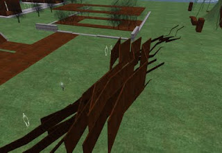
A NPIRL in world notice informed me that Keystone Bouchard has been working on some new ideas. I popped over to see what he was up to and he is doing some interesting things. I saw one piece he was working on which is untitled. Its a large metallic textured sculpture reminiscent of the first world site works or site specific movements. As I was looking and moving around it I began to daydream and think of how it relates to real world structures similar to it.Below to the left is Keystones work and down to the right is a real world site work done by Richard Serra sometime in the 1980's. Richards work is entitled "Tilted arc" and was installed at Foley square in New York. It spans 120 feet (36.5 metres) was 12 feet high (3.6 metres) and weighed 72 tons.
Richard Serras work arguably failed.

 What made it fail? It was designed specifically for the square and played off of the original design. This was not a problem. It conceptually dealt with the "Iron curtain" of the time ... not a problem. The problem was that it spanned a well travelled park effectively blocking morning commuters from getting to work. Everyone who had taken this short cut to work suddenly found a massive metal barrier forcing them to find a detour. After a public outcry the piece was removed. The artist had said he purposely wanted to make people have this type of reaction, and yet... his work is gone. I personally would say it failed due to its design and its placement in "reality".
When I looked at Keystones design I was able to fly over and around it. There was no irritation factor and I was easily able to navigate away to view other works. But it made me think about the second life equivalents to this. What are the things which can potentially cause irritation in the viewer with the side effect of them not properly experiencing what you had intended. What is acceptable and what is too much?
I recall going to an art exhibit last year where the original artist had set up his show and had allowed another "performance" artist to do their brand of art. It involved a screen full of chat spam .. some rotating prims with images of dog shit on them and some loud screaming. It was meant to be avant guarde but to me it was just annoying and I left within a minute. As a result I don't remember much about it .. the name of either artist or even what it was meant to be. Some artists like to defend their work by shouting loudly that its really the viewers who are too stupid and lazy to appreciate the deep message they are imparting. People are just not ready for it. Then it becomes one of those things where if you say you don't like it you feel guilty and somewhat a neanderthal.
So what I would like is for you the readers to leave a comment about things which you find annoying in builds. I think it could be very useful to other builders to know about them.
Here are some of the ones that bug me.
-giant towers that are difficult to climb in no fly areas.
-artists who hide things inside their builds so that nobody can find them.
oh wait... that's me.
.


Comments
cheap gw2 Goldmetallic textured sculpture reminiscent of the first world site works or site specific movements. As I was looking and moving around it I began to daydream and think of howCheap Runescape Gold it relates to real world structures similar to it.