
An Avatar as an extention to our Art
I was reading the catalogue for Rinascimento Virtuale 2008 the other day and came across something Dan Coyote Antonelli wrote about how he sees himself in Second Life.
"Dan Coyote's costume is intended to be simple and low bandwidth, placing the emphasis on work outside the avatar"
I understand what Dan is saying and I think it makes a great deal of sense. He does not want to get caught up with distracting elements outside of what he is focusing on, which is his art. I respect Dan's opinion, however, I find that I see creating art in second life in a completely different manner. My Avatar is an extension of my artwork, not separate.
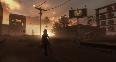
You see, in Second Life we have been given the unique ability to create what people see when they look at us. In real life we don't have the same flexibility. So when I created Bryn Oh I saw her as someone who will be tied to what I make. She is another canvas. But for me she goes much further. For example, when I create in Second Life I build off the colour wheel. For my particular taste I am fond of colour harmony. I like it when the vast majority of colours in my builds are variations of a set of colours. In creating this way I am able to create a more soothing atmosphere where there are few contrasting areas. But should I wish to make something a focal point for the viewer I need only make it of a colour outside the section of the colour wheel i have chosen to use. If everything has a bit of green in it and I place an object that is red.. the red will become a focal point because it is different and stands out to the viewer. The eye is naturally drawn to it. So when looking at the colour wheel we can create harmonic combinations using dyads, triads,tetrads and hexads off of the wheel. So what I mean by this is that when looking at the wheel two diametrically opposed colours are complementary. Creating shapes such as triangles and squares within the circle will create harmonious combinations. Anyway, this is probably quite boring to read so let me show how Bryn Oh lives within her creations.


 In each case you can see that I fit into the environment. Should you look up to the colour wheel you will see the vast majority of colours i am using are found within the blue section. I also use alot of grey because its fairly neutral and will absorb surrounding colours into it.
Actually now that I am on this, I should mention a related problem with Brooklyn is Watching sim. It is a open gallery where people place their creations for a panel of varying artists critique them. The overriding colour on the sim is an almost neon green. If you work on a piece using this type of colour theory and place it in BIW then you are suddenly forced to include a very strong green into your composition. Suppose your composition is a sculpture of all subtle greens meant to be in a field of red roses. It was built by you to stand out due to its contrast with the roses. Once its placed outside this environment into BIW it will suddenly lose its strength and disappear into the green of the sim. So when building it is essential to know where your creation will be exhibited. What I always had to do if i put something there was to build a barrier around my creation so that the green didn't affect it. Whats the alternative? well go in a gallery and check out the walls. They are always white. White doesn't affect most colour compositions. Even better is neutral grey. Anyway, I seem to have gone off on a tangent. For me the avatar is an added canvas. It is something that you create specifically and talks about you as a person. It is not an afterthought to what I create but an equal part in some cases. I also don't want to be distracted by outside influences when I create. So I am not an aka. No matter how successful I become in second life I will never reap any gains in my real life. This means I wont create things in a quest for real life fame. Just some thoughts.
Comments
Just wanted to share with you that your blog is in the running for "Blog-o-the-Month" at the ISTE Island Blogger's Hut in Second Life. Grab the "nominated" graphic at http://scottsecondlife.blogspot.com if you wish and encourage all your virtual friends to come visit! Congrats and good luck!!! And thanks for the ongoingly wondeful blogging!!!
What would SL do with out ?
IM so glad u call me friend !!!!
I am often reading here
often looking to see if u are on
and just cant never wait to see what comes next
xoxo
Constance Maurer
P.S I still think every one is a alt !!
Looking forward to this feed in my breakfast reading
Judy
JudyArx Scribe
Judy Cockeram
Wiki is a good start to understanding this light stuff – http://en.wikipedia.org/wiki/Additive_color
The age of imagination is coloured by Light